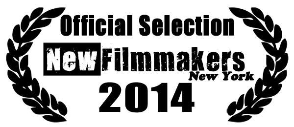
Oh hai! We’re in NewFilmmakers NY!
First, the big news: we will have our New York City festival premiere at the NewFilmmakersNY screening series! Details:
Thursday, January 2nd, 9pm (series starts @ 6pm)
Anthology Film Archives, 32 Second Ave. (@ E. 2nd St)
Price: $6 for the entire evening (includes two features and some shorts!)
Tickets/Info: www.newfilmmakers.com
We’ll be there with refreshments, drinks, and possibly some swag, so go get those seats! See you there!
Updating Your Promotional Materials… Without Losing Your Mind
This falls under the category of problems that are good to have. You get into another festival, or get a review, or one of your crew or cast wins an award/gets a great gig/etc. For whatever reason, you now have to update your promotional materials – your DVD artwork, posters, postcards, press kit, website, etc. Here are some tips that I’ve found for making that task a little easier. I’m still learning, so if you have some ideas, please feel free to email me!
- #1: Use layers: Whether you use InDesign, Illustrator, Photoshop, Quark, and/or even Word to put together your print materials and graphics, you want to keep the things that don’t change (like your film’s title and poster design) separate from the things that will (like your bio, the latest festival dates, etc.)
- #2: Put your credit blocks, review quotes, and bios into text files: This was you can cut and paste them into whatever document or promo piece you need. You can also cut and paste them into emails as needed.
- #3: Create a festival laurel leaf logo and save it as a separate file: Ideally, you should have this as a vector graphics file (so you can scale it up or down without creating artifacts), but if not, create or steal a large (5.5″ print size, 300dpi) size laurel leaf pattern, and save it as a separate file. Keep the left and right leaves in separate layers, so you can change their spacing as needed. You’ll need the laurel leaf at different resolutions and sizes; sometimes you’ll need a laurel with room for text inside, and at other times you’ll want to put the laurel together and place the text outside. I still use an ancient copy of CorelDraw for this, and found a leaf on the clipart disk. I brought it into Corel, edited the shape a bit, cloned it (for the right side), and then saved it. Then I exported it to TIFF and JPG files at different resolutions.
- #4: Work in 300dpi and downsample: You’ll need to prepare print versions of your posters, postcards, flyers, and press kits in 300DPI, using a CMYK color scheme. Web graphics are only 72DPI, and use the RGB color scheme. It’s easier to work at the higher resolution and downsample as needed, than to either create separate versions or use the low-rez version and upsample (in fact, upsampling usually results in crummy-looking print graphics)
- #5: Put all your EPK materials in one directory: This way you can burn the entire directory to a CD or DVD as needed, without having to think about it.
- #6: Many small updates are better: I can tell you from many years of web and desktop application programming, that it’s better to do a lot of small updates than to try and update everything at once, but less often. You can get away with monthly updates to your blog and Tumblr site, but your Facebook page and Twitter feed should be updated on a weekly or semi-daily basis if at all possible.
- #7: Remember the difference in blacks and whites: In the RGB colorspace, black is 000, white is 255/255/255. In CMYK, black is 75/68/67/90, white is 0/0/0/0. CMYK colors don’t always look right on the monitor, so don’t just go by eye.
- #8: Keep a list of your fonts somewhere: If you ever have to send something to a printshop or another artist, you’ve seen this: the design you slaved on for days looks like crap because they didn’t have the font you were using. The answer is to keep a copy of the fonts you use in your designs in a folder or ZIP file somewhere, so you can send them along with your graphics files. InDesign can take care of this for you, but Word doesn’t really care.
- #9: Make a separate file with your film’s title logo: Your film’s title is also its logo, so it MUST look consistent across all your letters, posters, postcards, presskits, etc. On Found In Time I created a type layer in Photoshop, wrote out the title in a really large size, rendered the layer, and applied a number of filters to scratch and distort the text a bit. Rather than do this over and over again for each poster/postcard/etc. design, I saved the title to a PSD file and then rendered it to a 300DPI TIFF. This way I can insert the TIFF in all my other artwork, scale it/downsample it as needed. I recommend keeping your title it black and white, simply because those are the easiest to read. You can always color it later.
- #10: Back Up Locally There are a number of cloud-based services for storing your work, but none of them are completely foolproof. Always make sure you have a complete local backup of your work. I’ve heard too many horror stories of work disappearing to trust non-local storage completely.


